Stage 1: Empathize—Research Your Users' Needs
Problem Statement
The issue that I am trying to solve is making a golf app that is free to use and can be used in most scenarios on a golf course. The scenarios I want to cover are more regular play, tournament play, and league play.
Recruitment Strategy
My recruit strategy was to find people, directly and indirectly, focused on how connected people would be with the app. For the directly involved I tried to find people more engaged with the course as a local or regular golfer. By this I had someone I knew who was on the golf board and did tournaments and leagues. Another directly involved type of person I did was they are familiar with but are not as competitive. The more indirect people I ask were those who know golf or aren’t familiar. This one was a little easier because I could go ask engineering students for this part. My main goal was to get a few people familiar with the issue and then try and get a diverse opinion on the issue.
Interviewing Strategy
For my interview strategy, I used the approach of getting to know the other person briefly by finding out information about local status, golf status, and everyday devices. Similar to how a car can show people their personality , their phone can also say the same. After finding out this information I can then ask for more specific details that are included on other golf apps or missing from other golf apps
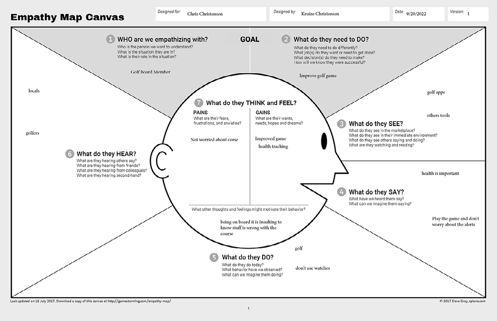
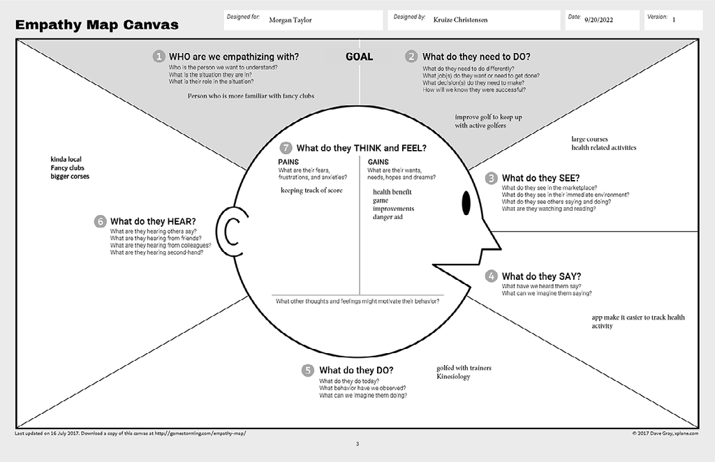
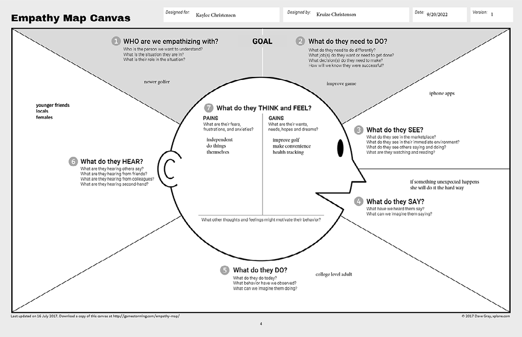
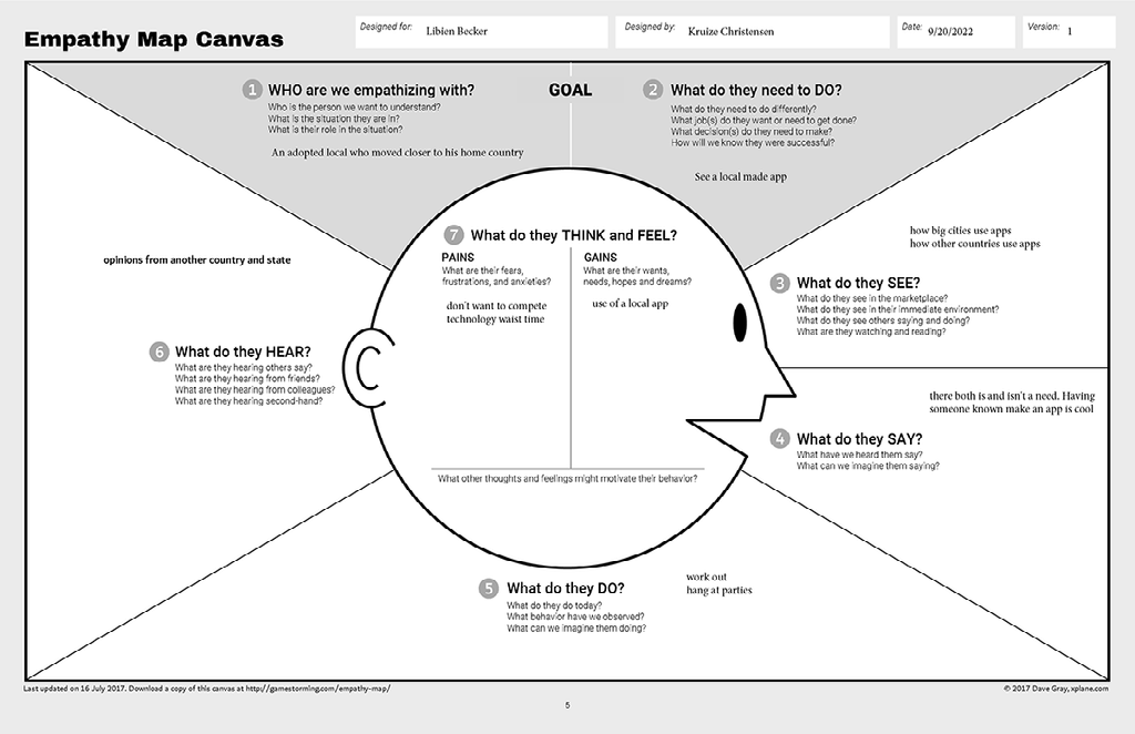
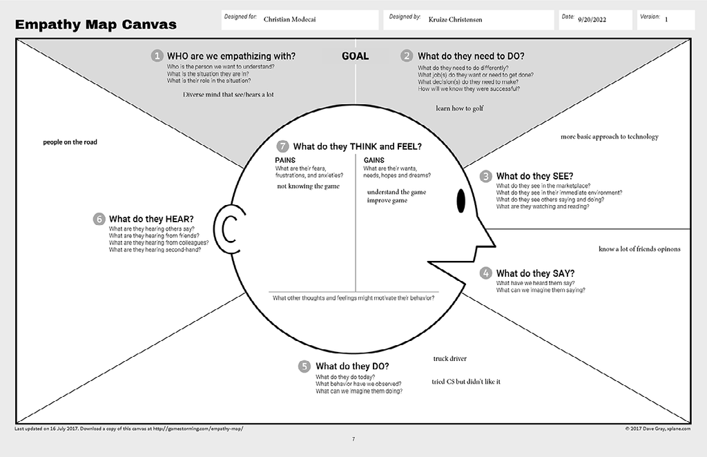
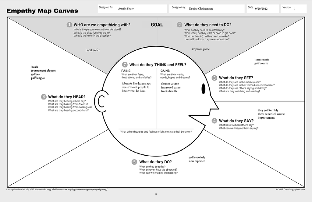
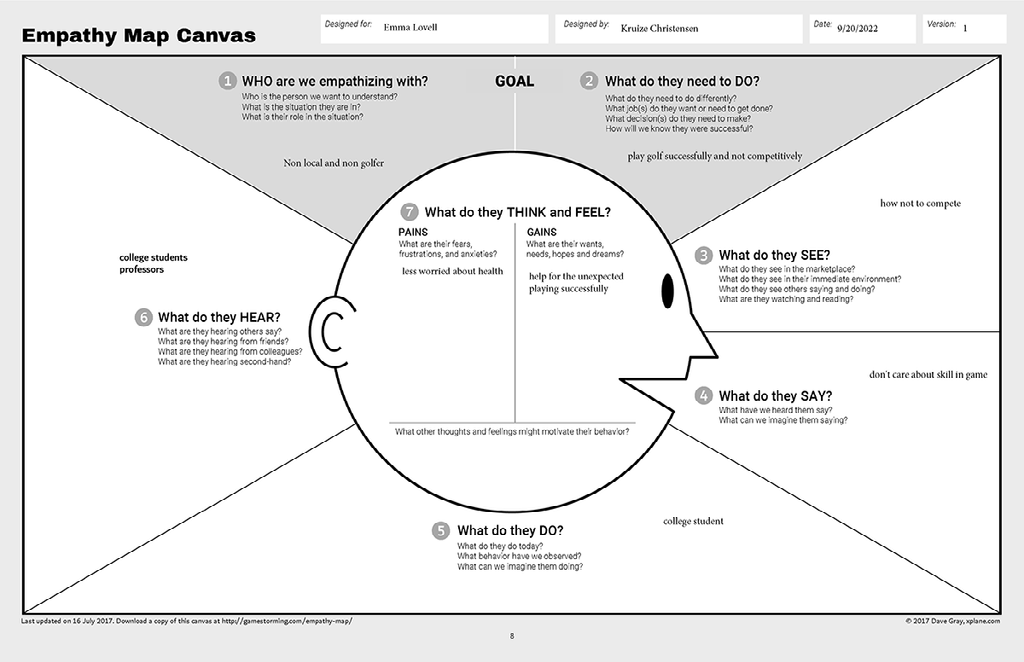
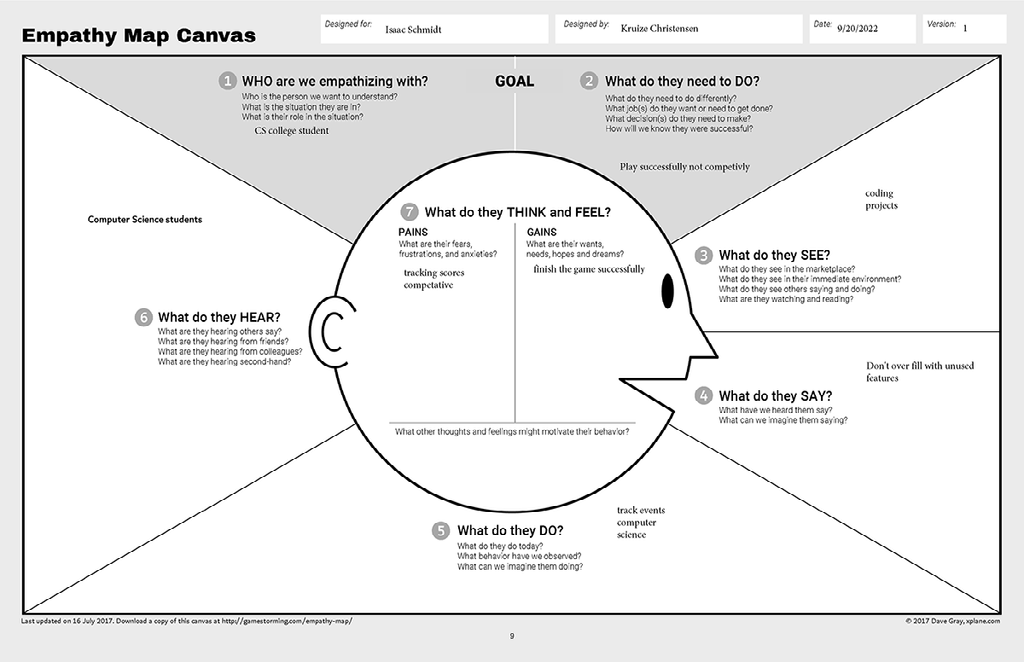
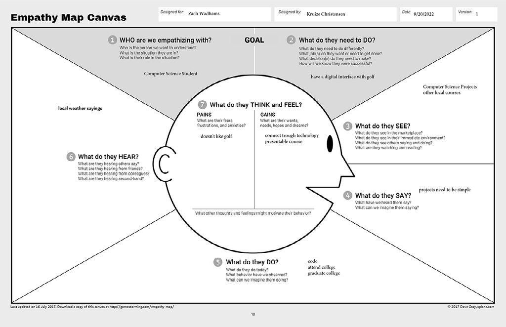
Empathy Mapping Canvas


Conclusion
Here with the empathy maps, I found some more unexpected results in this. A lot of people seemed to have a lot more interest in golf than I thought they would have. Like my sister was one of these and she hasn't ever had an interest until recently. Other where I thought they would be more for the app and less about golf were surprisingly the opposite of what I originally had thought.
Stage 2: Define-State Your Users' Needs ad Problems
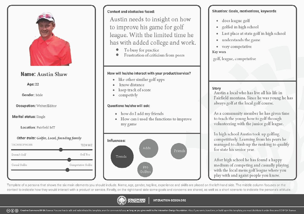
Personas
For this, I decided to use Austin for the persona. This is due to his relationship with the golf course and not being in a position where his action will affect the public view of the golf course. With that in mind, I also wanted to pick him more for his experience in what he has participated in, high school golf, and league. Also with his age and what he has been through technology has been more a part of his life than most generations.
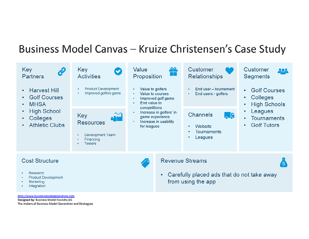
Business Model Canvas
With the business model, I wanted to more look at what are my core values toward the app or what I want to gain. With most of the sections in this, I want to this focus on the game specifically. For that reason , I want to make golf easier to play so I have to focus on where people will need the game to be easier. This would result in the competition so that is where the key partners come in. With this, I can focus on groups that will be affected by the app in general which would be golfers. The one thing that is a little more difficult than I specifically wanted for the app was a nondisrupted revenue stream. When you have to pay a subscription most people will not use the app and the alternative is to have ads which even get very irritating. My vision for this is to do something similar in that movies do add sponsors or adds hidden inside the app. All in all the business model is very straightforward without business knowledge.
Conclusion
With stage two I found a lot of specific details that I overlooked. One I honestly forgot to calculate into the app was the cost. It is a little embarrassing but I guess that is more my personality of helping people first rather than thinking of myself. Another part that I discovered is my partners or target group. This wasn't too much of a surprise but it was good to clarify how many I have and what they are. To focus on the persona I learned more about what middle-aged people would feel about this. One thing that I learned was the following trends which I don't like doing. This was very interesting since golf is a very laid-back sport. One thing I did clarify with the business model is revenue is the revenue stream. With this I personally am against subscriptions and ads that break apart the user experience. After giving it some thought I want to focus on something similar to ads in movies and that is where I want to focus on income.
Stage 3: Ideate—Challenge Assumptions and Create Ideas
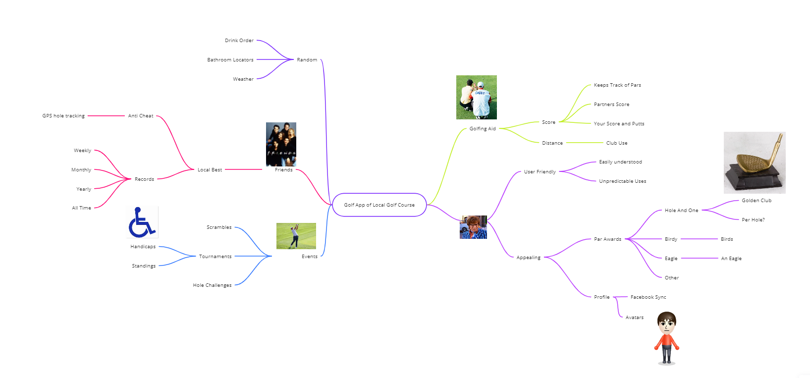
The way I liked to generate ideas is to have a starting point. Similar to how mind mapping starts. At that point, I try to write down as many ideas that can connect to the one branching idea. A lot of ideas that I tried writing down were ones that were already there but I still even when off of those. One very unique one that I had put down was a golden club. This is more of an old fashion thing that golf courses, or more particularly, my golf course used to do. The rule was if you scored a Hole and One on hole number 5 Dirkes, a company and Fairfield would buy you a golden putter. The only reason I know about this is that my grandpa, Co-owner of Dirkes agreed to do this when he sponsored the hole. Almost everyone forgot about it till my younger brother ended up getting a hole and one on that hole. What came first from this was having messages or confetti similar to virtual minigolf games. In short, where one idea lies another idea can grow off of that. Also, the way my mind generates ideas can be a little different since a am a bit dyslexic.
Mind Maping
Conclusion
My findings with mind mapping are ideas can make new completely different ideas. The one part that surprised me the most is slowly trickling into an old fashion idea just by going off of newer or more present-day ideas. I went from virtual golf to an old fashion contest that went away years ago. It even worked very well and could potentially be implemented into this app if I choose it to. Even besides that I ended up adding more ideas because of this and it made a narrow mind of thinking able to wander off of ideas.
Stage 4: Prototype—Create Solutions
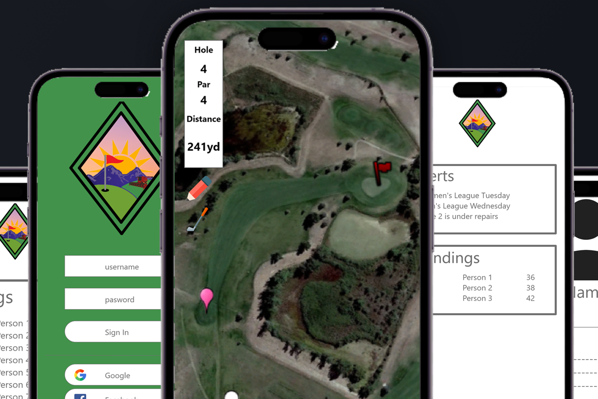
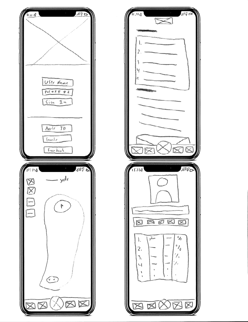
Low-Fidelity
High-Fidelity
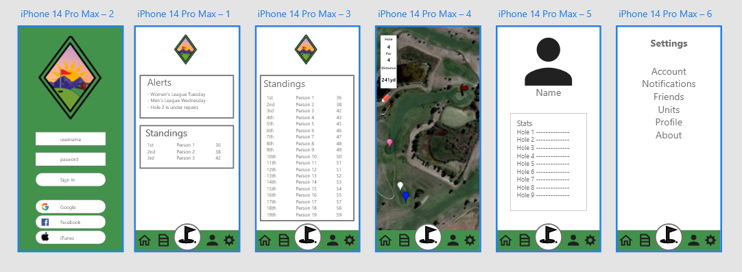
Usability Heuristics
1: VISIBILITY OF SYSTEM STATUS
This is done through adequately labeled pages for the user to understand what is happening. Most of the labeling is done for people with golf experience in the understanding of the game. Other symbols are included to be simplistic and easy to understand.
2: MATCH BETWEEN SYSTEM AND THE REAL WORLD.
Most of the words used are golf terms where the user will know what is meant if you know the games. Other uses are pictures that revolve around familiar app icons or similar that can be directed toward the functionality.
3: USER CONTROL AND FREEDOM
This is done by keeping the bar at the bottom of the app constantly there, with the exception of the login screen. This makes it so users can return to any part of the app they left off. There is also the added red x button that I made for part of the app as a more formal approach that people would recognize more and looks better than the bar for exiting.
4: CONSISTENCY AND STANDARDS
This is one of the reasons why I have the bar at the bottom of the page rather than flipping through different pages in the app. This makes it more consistent and easier to use than flipping from something different.
5: ERROR PREVENTION
This one was a little easier to prevent since a lot of the functionality of the app involves coding which is the design portion that we are still working on and won't go past. To prevent most errors I tried to make sure everything is linked correctly. I also added some red X on some to make it easier to prevent errors for transitions.
6: RECOGNITION RATHER THAN RECALL
With this, I tried to add more icons that people were more likely to recognize. Like a house for a home page, a person for a profile, and a gear for settings. Even a pencil for entering your score. All of these are common icons that people are more likely to recognize rather than remember.
7: FLEXIBILITY AND EFFICIENCY OF USE
The red X is a great example of what could be done or you can just go to the bottom when you are done reading or entering information. Either way, it can be used and still come with the same outcome and it would be up to the user.
8: AESTHETIC AND MINIMALIST
With this, I tried to take out as much information overload as I could. Like adding multiple people to a scorecard. I personally have tried this with other apps and it gets a bit confusing. With aesthetics, I tried to keep a constant theme like using the bar at the bottom of the page. I even matched the app to the logo that I built specifically for it and kept the color scheme to use throughout the app.
9: HELP USERS RECOGNIZE, DIAGNOSE, AND RECOVER FROM ERRORS
Most of the app is pretty simplistic and this would be difficult till some coding can be done to make the app more usable. Since it is simple it would be easier to see when something is off or not working properly. The best part to help with this issue would be going to help in setting up every other app or use the contact in the app store. Any errors should not affect users to the degree of not being able to golf.
10: HELP AND DOCUMENTATION
This is located in the setting like most apps and can be easily found in the settings. This is included for common issues that would appear after the use of the app by users, or issues that come up in testing.
UX Laws
Hick's Law
I tried to use Hick's Law when designing my app. I tried to take away as many complicated steps as I could. This is without oversimplifying where I could only have one decision per page which would make it more annoying to use. Also, I tried to set it up in a way where you could gradually introduce yourself to features and not get forced into things like most applications do to try and make sure you understand that app completely which can be exciting.
Law of Common Region
With this, I tried to make a basic area defined by a box that does not disappear. This is the bar at the bottom of the screen. This makes common ground for the navigation adding structure to the app where a user can be comfortable. I have seen apps that switch bars or completely get rid of a bar during a function. This panics the user and oftentimes confuses them.
Miller's Law
As stated an average person can keep 5-9 items in their memory. That is why I tried to add 5 distinct categories to the bar. With this, I can organize different functionalities into this. Doing the app this way makes the app easier to use and memorize. Also by making more memorable icons, it also works off of prior knowledge and makes it easier to understand in the long run.
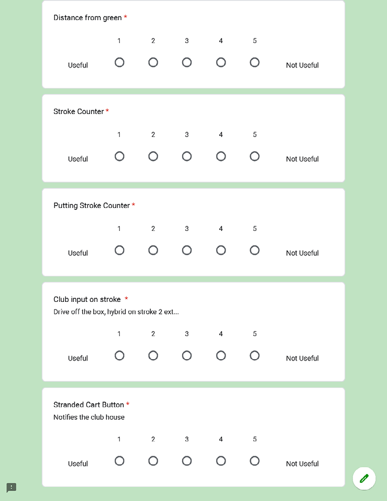
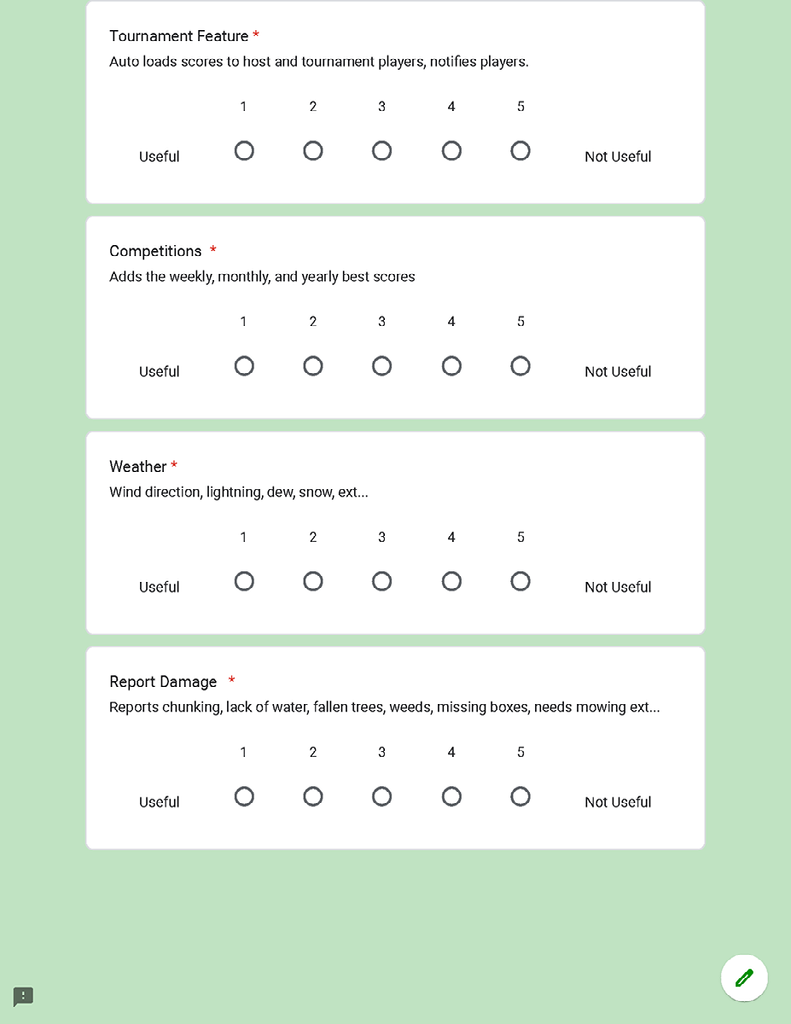
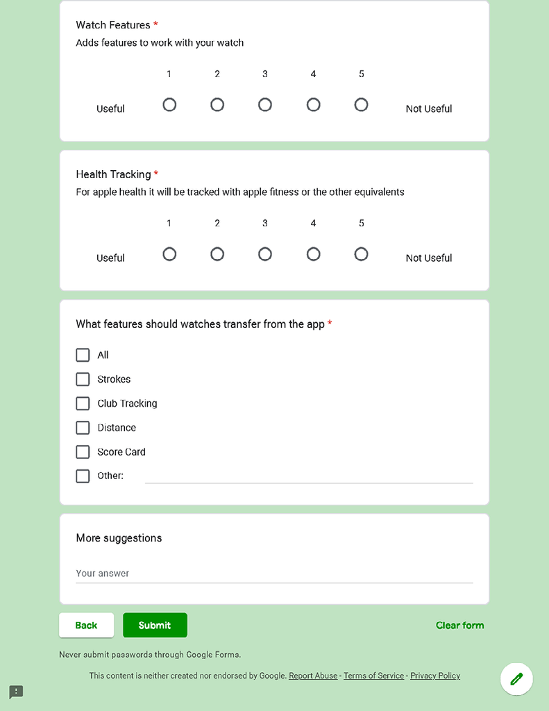
Stage 5: Test—Try Out Your Solutions
Background Summary
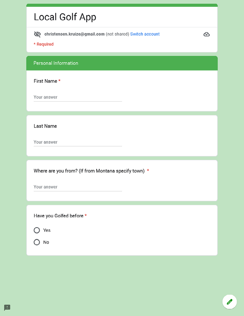
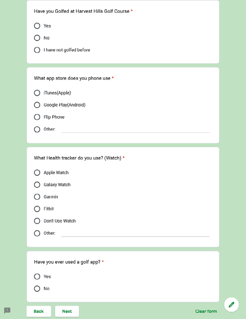
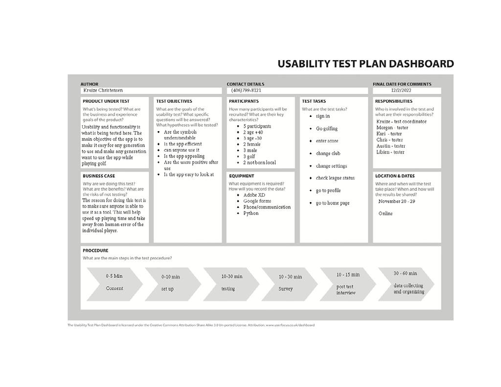
Here I wanted to test how comfortable users would be with my app. Since the app is focused on a local population, I wanted to have local people test the app. The way I had people test it was remotely. So I used a google form with steps for the user to test out functionality. I would also call and talk to the people testing the app to make sure everything was working correctly and that they understood what task I was asking of them. The one thing I was worried about with the prototype was the devices people were using with adobe XD, because the solution for the phone I chose, and the people I was interviewing all had different phones.
Methodology
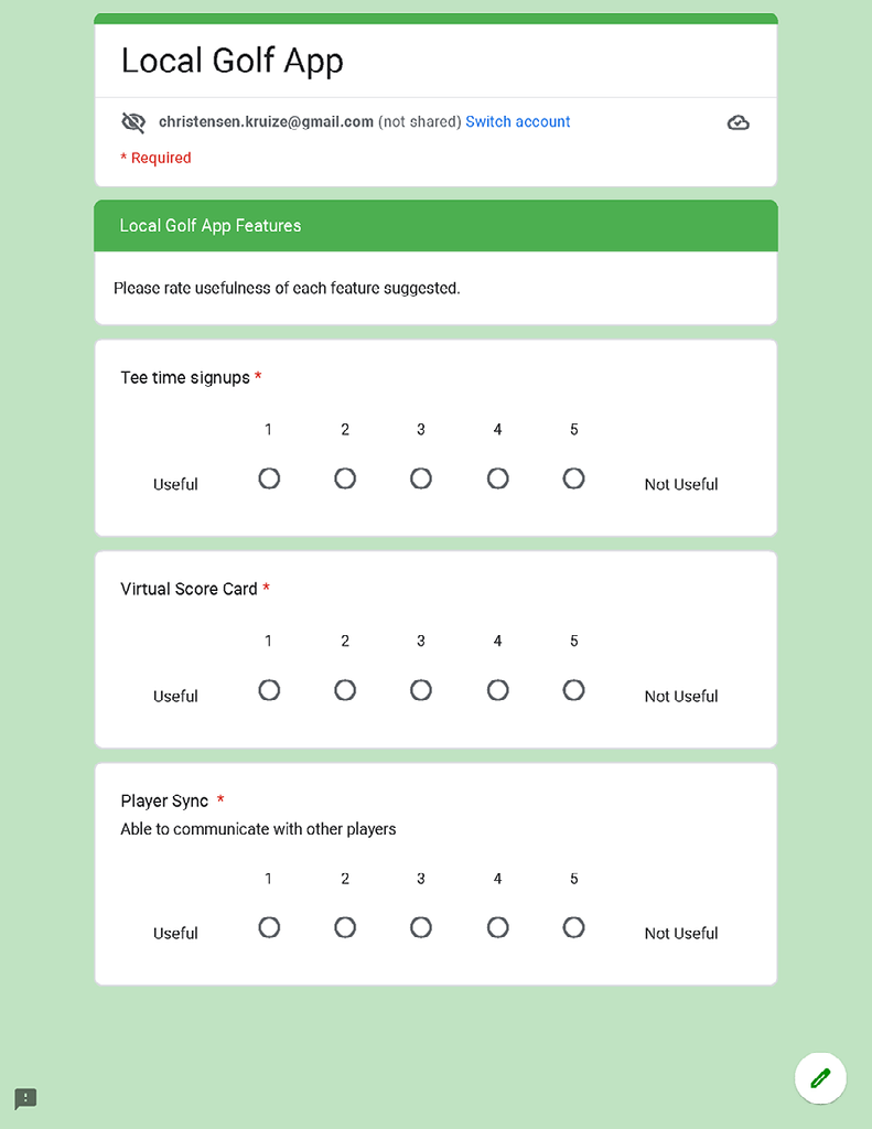
Test Results
With the results, I used python to generate answers and graphs to the data that I collected. The code that I used to calculate these answers is located in my GitHub repository for this class.
Code
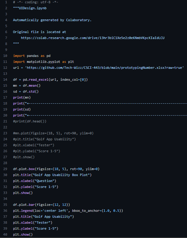
Here is the code I used
CSCI 443 GitHubMean
With python, I wanted to get the mean of each task I had the tester complete. With this I get a better representation of the functionality overall.
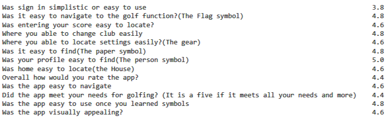
Standard Deviation
With the standard deviation, I was able to see how far I was from getting a perfect score from my testers. The closer I got to 1 this meant I need to work on it and the closer I got to 0 means the more it was very simplistic and easy for the user to understand.

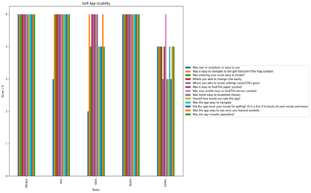
Graphs
With both of the graphs that I used there is a certain meaning behind each one that I wanted to take away from data science and statics. The first chart is the classic bar graph I wanted to show the differences between each tester. As I mentioned before I wanted the testers to be local or familiar with the golf course I am specifically targeting for the app. The other part is having a very diverse group. This ranges from having 2 females (left 2) and 3 males. Others would be an age where the two in the middle (Kari and Chris) are in their 40s and the rest are in their 20s. There are also the two on the edges who are less familiar with the golf course due to one being from another town(Morgan from Helena) and the other being from another country(Libien from Hati). With all of these taken into account, it is very interesting to see more diverse opinions to potentially fix the app to meet all their needs.
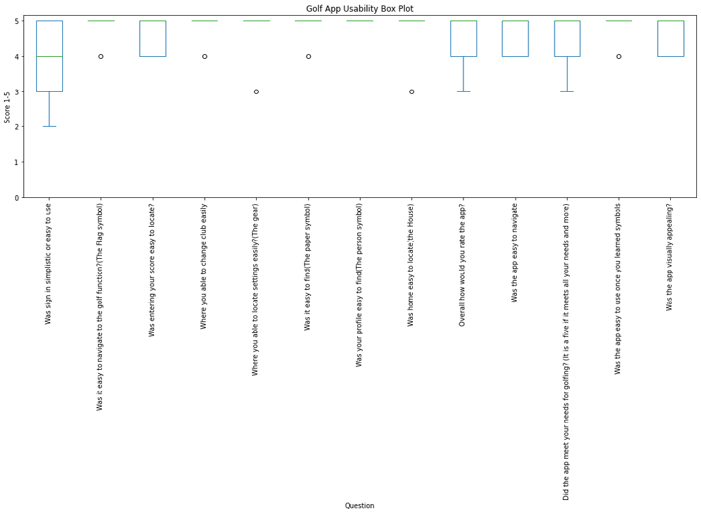
With the box plot, I wanted to see if I could detect any outliers. This will help get rid of some potential human error when it comes to testing or just seeing someone with a very different perspective. I wanted to run this plot due to the last survey I sent to people having an outlier that I personally noticed and it was one of the people I surveyed who filled in the answers backward due to repetitively answering surveys in the opposite direction I had. I learned this technique in stats to potentially find errors in the data.
Findings and Recommendation
First off when having a user test my app out I found out the hard way, but I learned adobe xd is not compatible with my word and grammar checker for my dyslexia. One of my testers pointed out that I had a lot of misspelled words. That is one issue I would need to fix when finalizing the app and I would involve more testers or just auditors.
Another issue I ran into and had to help guide some of the testers through was the login page. I probably should not have one till the app is complete but in my mind, I wanted a way to save the personal profile and league placing. Since it was a prototype and didn't have functionality as a login page I confused half my tester into thinking it was real. That is why the first bar for most of the testers is so low.
The one that got the most positive feedback was the profile because of the easily recognized symbol. This surprised me because the gear is more recognized as a setting symbol but it confused a tester.
The one thing that I would recommend is finding a way to make my prototype fit the screen of the user/tester. This is because testers had to scroll when testing. I got a little ahead of myself for wanting all smartphone types able to use the app. From the first survey, I should have used the phone type data and taken that, and I should have asked for the model as well.
