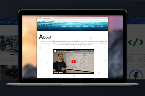
Overview
For the RoboSub club called RoboCats, we go and compete at the international level at the RoboNation competition. Rather than just focusing on the task for the robot, Typhoon, we also do some other tasks like building a website. In previous years our club has not had an outstanding website. Starting out as the only computer science major in the club I ended up focusing on web development since it was all I could do at the time and I was still studying how to make the robot do its task.
Research
First off I did a lot of research into what the club had had in the past. What I came up with didn't really fit the club. Before I joined the club didn't have too much advertising since we have a sponsor. So with it, I wanted to make the website more blue due to us being in the water and it also is one of our university's colors. The second part of it is we want recruitment since it was just me and the president at the time. So I wanted information about the club included on the website as well.
Competition Scoring
Since we compete with building the website as well we also have some scoring criteria that are given to us. The criteria I am giving below is to fit the 2022 Team Handbook since this is the year I got to compete in.
1. Website Content: Layout and detailed contents of the website are left for the teams to develop; however, the team website should include:
2. Website Quality: Websites are often the first impression of a project. Potential supporters such as supervisors, sponsors, or advisors must find the website visually appealing and easy to navigate. Development of the website should include careful consideration of user experience, including:
- Written in English, or English translation provided
- Clear prioritization of key content
- Site search functionality
- Basic design elements: contrast, repetition, alignment and grouping to organize/highlight content
- User accessibility, as defined by the W3C Web Accessibility Initiative: www.w3.org/WAI
- Cross browser compatibility for modern web browsers (Chrome, Firefox, Safari, MS Edge)
- A mobile friendly display
Results
In the end, we scored decently high for the website portion. More than we have in the past. On the design portion we did well on but the part we struggled on was the information. Since this was a multigenerational sub we didn't have a lot of the information needed for the website. This was the part that we needed to score higher in the end.
Website
The portion of the website that I completed over the years is located on my private server to not display changes made by the current team. I will also include a link to the current website as well.
